People make up all sorts of reasons why online grocery shopping is only at 7-10% of sales in the UK and only 1-4% over a lot of Europe. There are 2 reasons – last mile costs and terrible (truly, truly terrible and outdated) online and app UX.
Now Walmart’s Asda has created a world-class ‘visual search’ feature that makes online grocery shopping much easier. If you’re not convinced this is such a big deal, you might enjoy my posts The World Needs A Great Food App or The World Needs A Great Food App Part 2 that I wrote in 2016, pointing out the gap between a great and a garbled shopper user experience in online grocery.
Here are 5 reasons why Asda’s new visual search makes online grocery shopping so much easier – and what FMCG brands should do next to make the most of this opportunity…
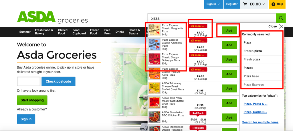
Pictures
Seeing ‘top products’ immediately on typing a search term (before you even click through to a SERPs page) is inspired. It means people can more easily spot what they want and select from the most popular products.
What CPGs should do: Check whether your best-selling products appear in Asda visual search. Ask Asda what factors and weightings are used to generate visual search results.
Offers
Because offers are surfaced high up – and clearly signposted – in these visual search results, it helps savvy shoppers easily find deals even faster. But it’s also a great way of linking the UX back to Asda’s Every Day Low Prices strategy. It helps FMCGs get maximum exposure for their investment in promotions. It’s a win for retailers, shopper and supplier.
What CPGs should do: Ask Asda if promotions automatically appear in visual search, or what you need to do to ensure that yours does.
Add To Cart
Enabling shoppers to add to cart direct from search – even before they have reached a full search results page – is genius. This makes shopping a lot fast (as long as you like a lot of popular products – which Asda shoppers do). It’s a beautifully simple idea that makes a good feature, great.
What CPGs should do: Analyse Asda online sales before and after these design changes to see if this simple Add To Cart feature increased or decreased sales of your best-selling products.
Search Suggestions
A shopper’s search generates a list of other Commonly Searched search terms. This does two things: It allows Asda to educate shoppers on which search terms they should type next time to generate the right choice selection e.g. If I want a Frozen pizza, you’d be better off typing ‘Frozen pizza’ over ‘pizza’. It also gives shoppers an easy next step to take if their search results don’t show up the results they were wanting (This is a key problem to solve – when I was at mySupermarket I was surprised at the volume of 2-step searches shoppers used to find what they wanted to buy).
What CPGs should do: Ask Asda for a list of popular category and brand search terms and investigate how your brands are ranked for each search term in visual search. Use a digital shelf analytics tool to understand your share of search for these terms – check out efundamentals, Metrico, Profitero or Edge if you don’t have a tool in place, or DM me if you want advice on which tool would be right for you.
Surfacing Popular Products
Some retailers have increased the number of own label products that they have artificially boosted in their rankings, meaning that an own-label product is more likely to be bought over a more popular branded supplier product. This drives FMCG Heads of E-commerce mad of course, but what can you do? Well, it seems like Asda is focussing on what shoppers are actually looking for (at least in the search terms I tried) by surfacing the most popular branded products first.
What CPGs should do: Compare how your key account retailers surface your products vs own-label products for your key search terms.
This is a fantastic piece of user-centred design by Asda which I suspect will make online grocery shopping easier and faster for current and new users.
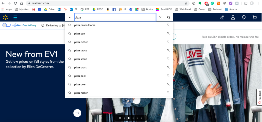
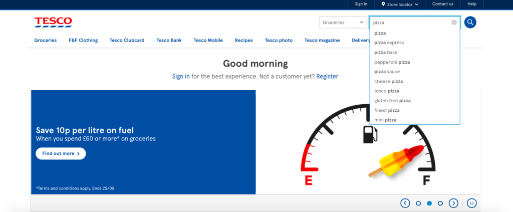
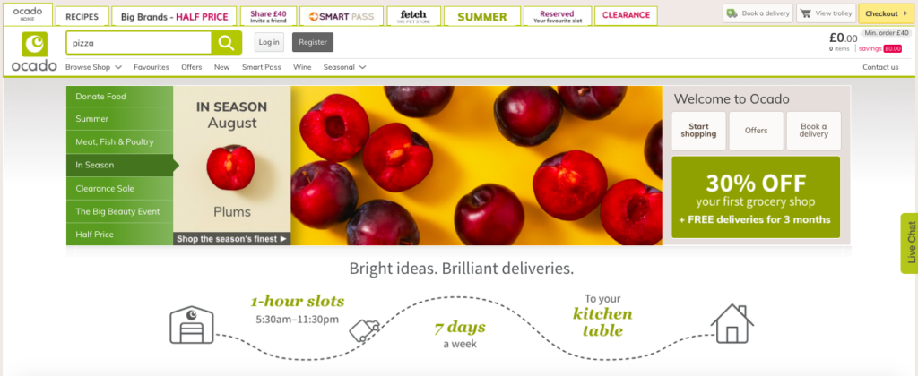
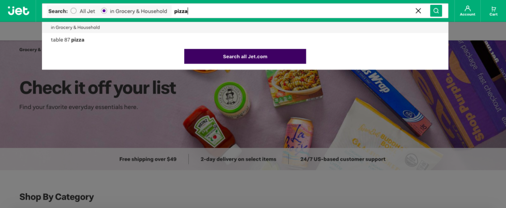
For comparison, below I have added screenshots from a number of UK and US online grocery websites for the search term ‘pizza’ – see for yourself the difference that Asda’s UX makes.
Viv Craske is a consultant for FoodTech startups, CPGs and retailers, and an expert in grocery e-commerce. He is the founder of FoodTech consultancy Geeky Foody, which provides strategy to create a food system that supports technological innovation and the realisation of the UN’s Sustainability Goals to feed 10 billion people by 2030. To work with Viv, email viv@vivcraske.com
He is former Managing Director of mySupermarket and author of Surviving Digital Disruption – The 7-Step Digital Marketing Strategy To Futureproof Your Brand On The High Street And Online.
